

Color Inverter
Upload a photograph and use the color inverter to turn light into dark, shift every hue toward its opposite, and create a clean negative in seconds. Start with a photo, illustration, scan, or design image, then use light and dark tones, saturated accents, and graphic contrast to keep the direction clear before you generate. The finished result should work for negative effects, poster graphics, moody edits, and color studies.

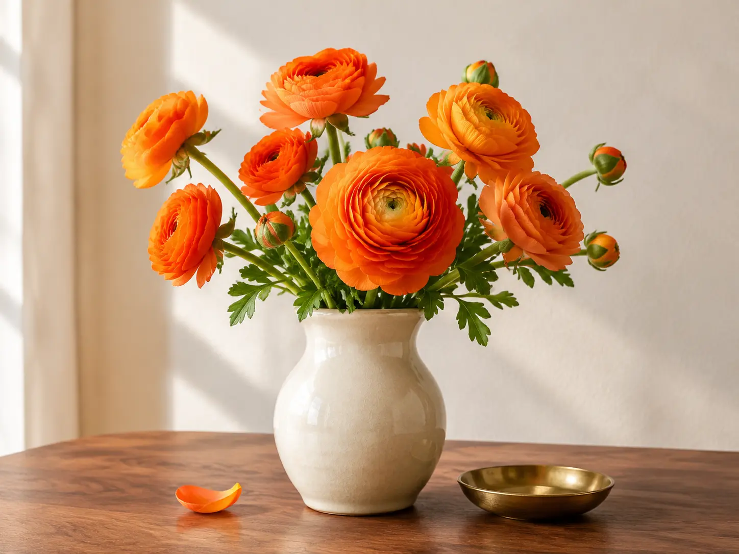
No picture on hand? Try with one of these
What a Color Inverter Can Change
The strongest results come from treating inversion as a real color transformation, not a muddy filter laid over the original.

True Negative Color
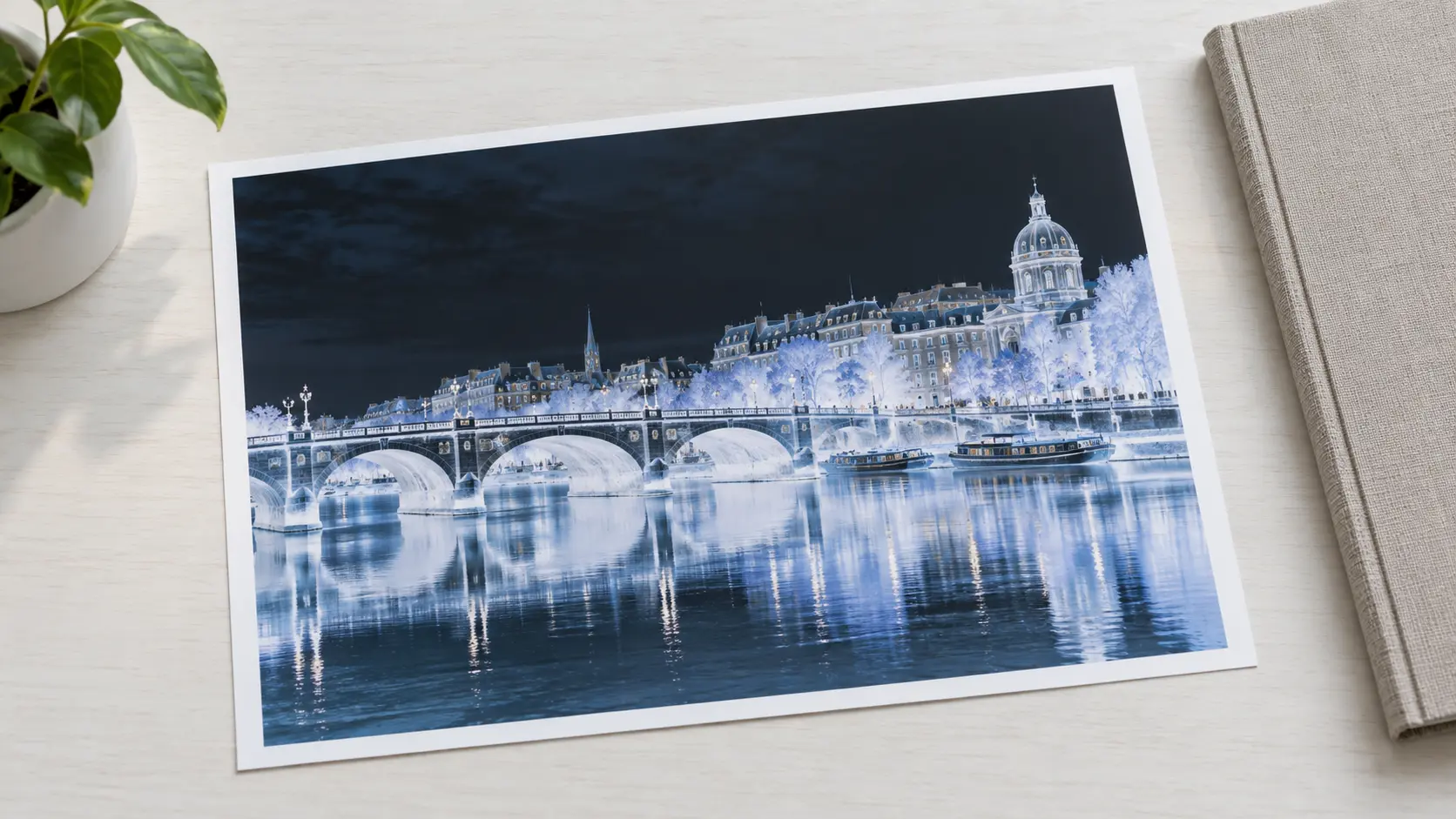
The color inverter reverses light and dark values and moves each hue toward the opposite side of the color wheel. Bright skies become deep, warm flowers turn cool, and the image reads as a genuine negative. The result keeps the original shapes visible while replacing the familiar palette with a more graphic set of color relationships. The strongest use of this feature is to make an inverted-color or negative version work for negative effects, poster graphics, moody edits, and color studies, not merely to create an attractive preview.

Details Stay Visible
Inverted colors can easily become flat or noisy. The tool protects edge definition, texture, and tonal separation so small shapes remain readable after the color inverter has completed the shift. Fine lines, fabric, foliage, and facial features keep enough contrast to guide the eye instead of disappearing into one solid color field. If the first attempt misses the mark, describe the exact part of light and dark tones, saturated accents, and graphic contrast to change and leave the rest of the direction fixed.
One Upload, One Result
There is no layer stack to build and no color channel to calculate by hand. Upload the source image, choose inversion, and the color inverter returns a finished image with the full frame intact. Because the workflow uses one clear input and one deliberate transformation, it is easy to compare the result and try another source without rebuilding the setup.
Built for Creative Reuse
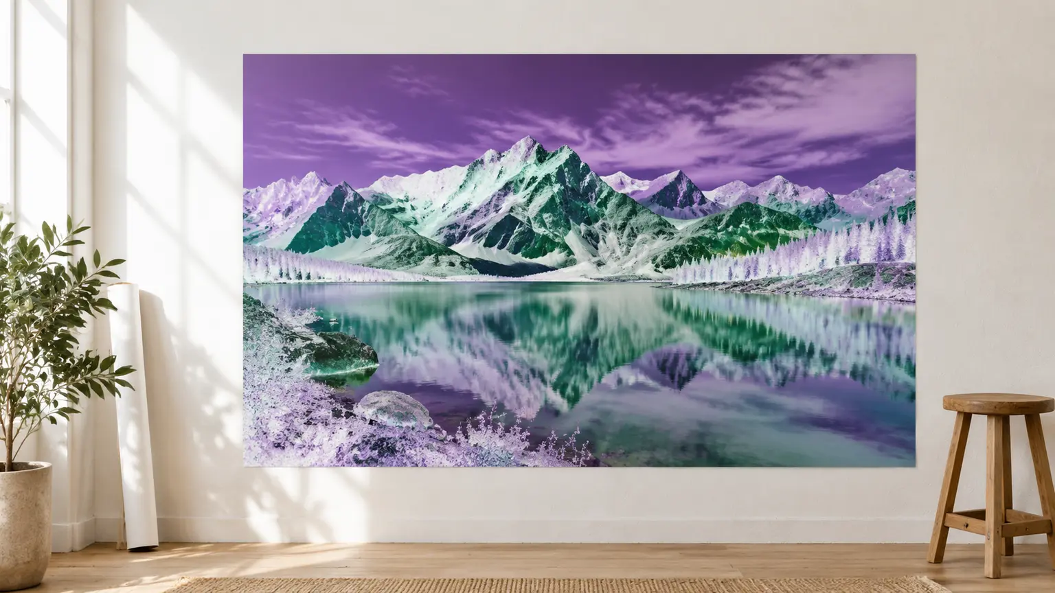
Use the inverted image as album art, a graphic accent, a bold social post, or the starting point for another edit. A clear negative gives the next design step stronger contrast to work with. The unusual palette can separate a subject from a busy background or turn a familiar photo into a visual texture for posters and covers. For album art or a poster accent, invert a copy rather than the only edited master.
How to Use the Color Inverter
Three direct steps take the image from upload to an inverted file.
Upload Your Image
Choose a JPEG, PNG, or WebP file with the subject and composition you want to keep. A clear source makes the inverted result easier to judge because detail in the shadows, highlights, and edges will remain visible after the transformation.
Invert the Colors
Run the color inverter and let it reverse the image tone and hue relationships. The frame stays in place while the palette changes, so you can compare the negative with the original and decide whether the contrast still supports the subject.
Review and Download
Check highlights, shadows, and any color detail that matters, then download the negative when the balance looks right. Look for blocked shadows or shapes that disappear after inversion, and try a different source if the composition becomes difficult to read.
Who Uses a Color Inverter

Graphic Designers
A color inverter creates an unexpected palette without rebuilding every shape. Designers can use the result as a background, poster layer, or visual counterpoint to a normal photograph, giving layouts a distinctive color idea that is difficult to reproduce with a standard tint or filter.

Color Inverter Use Cases
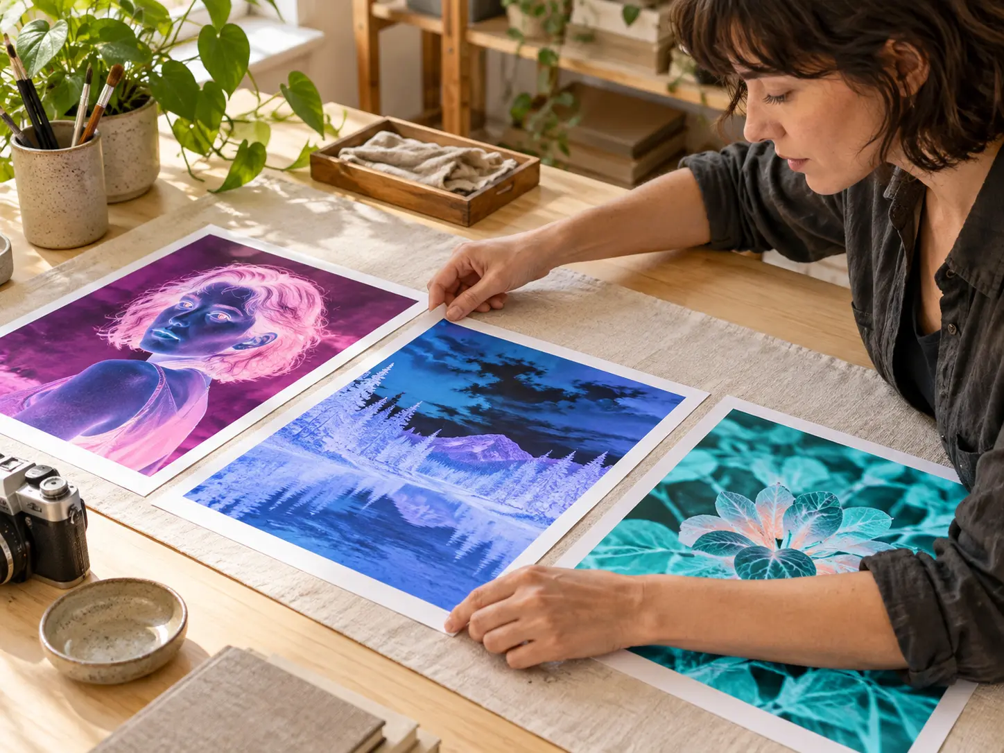
Use inverted colors when the image should feel unfamiliar, graphic, or immediately eye-catching.
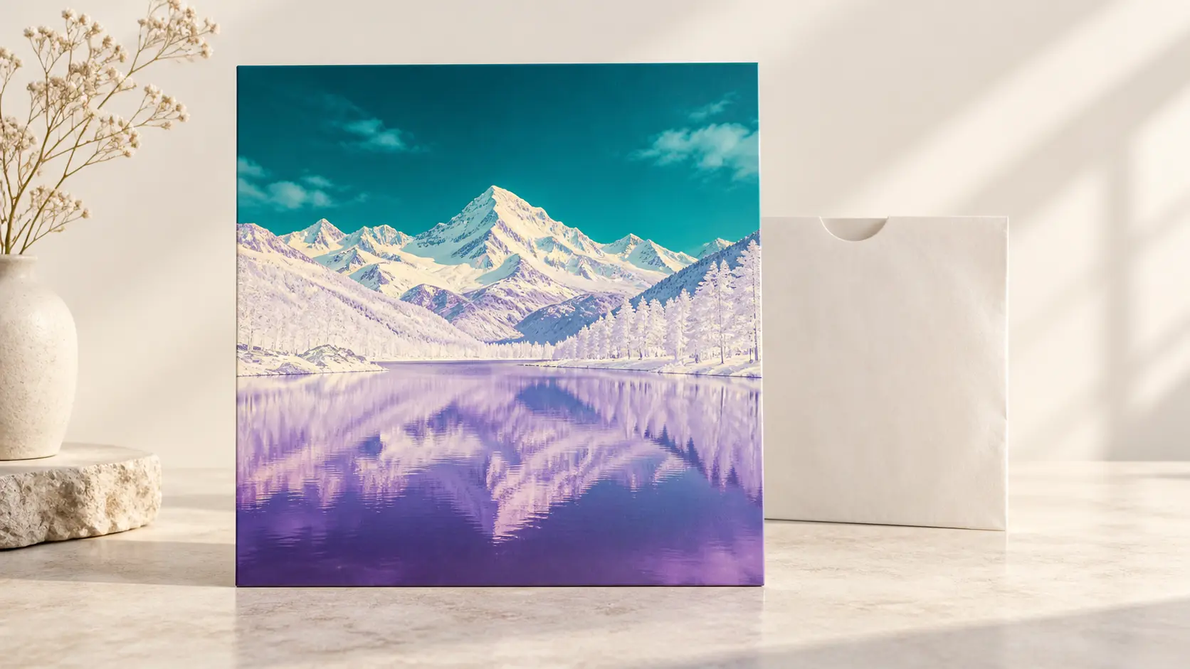
Album Art
An inverted landscape or portrait gives a cover an uneasy, atmospheric edge that a standard edit may not reach.
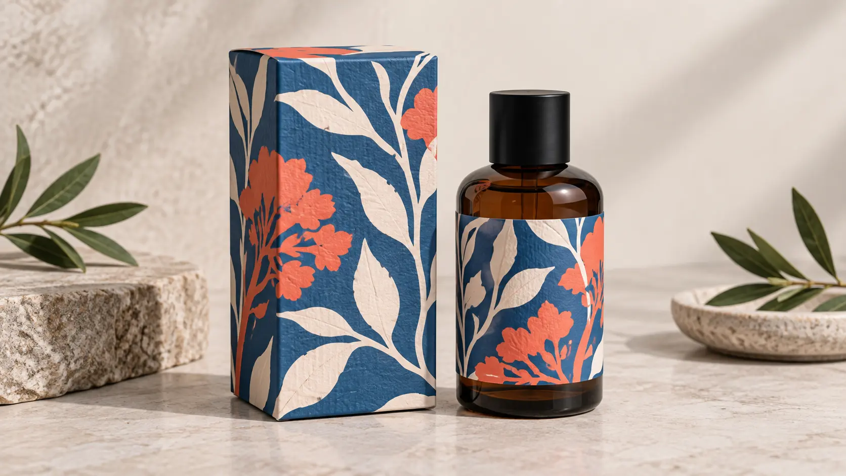
Brand Experiments
Test a photograph against an unexpected negative palette before committing to a campaign direction or packaging mood.
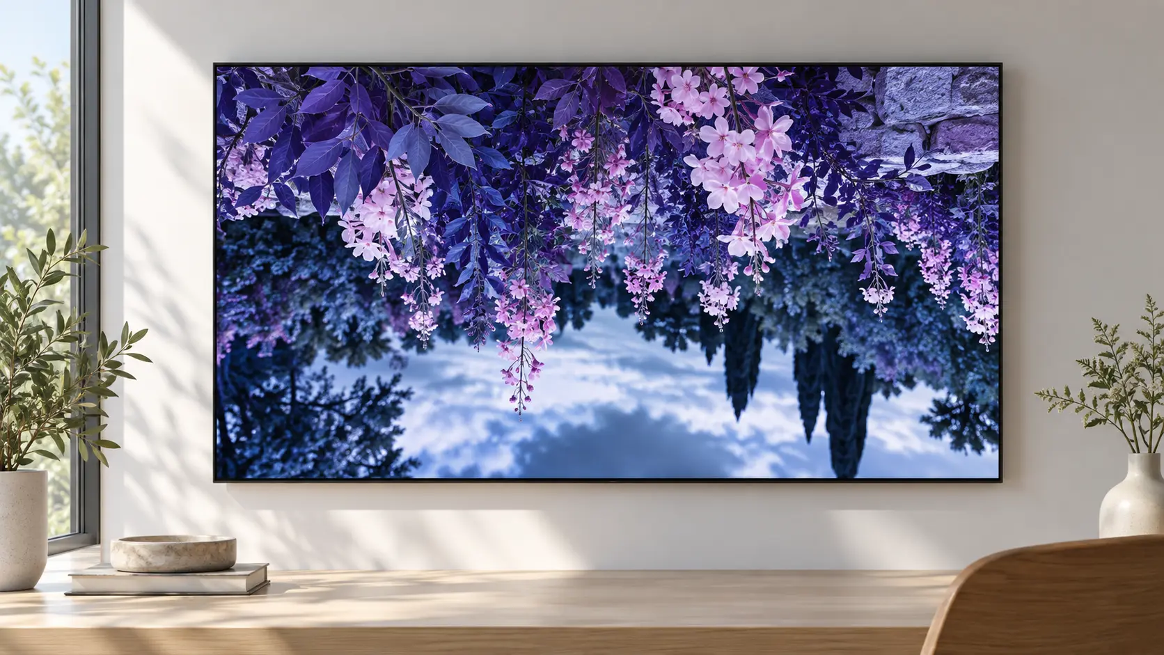
Creative Wallpaper
Turn a familiar city or garden scene into a graphic negative for a screen, poster, or editorial background.
Color Inverter FAQ

See Your Image in Reverse
Upload a photo and let the color inverter turn its palette into a bold negative.
Get Started