Turn A Visual Direction Into A Shared Reference

Mood Board Maker

Use this mood board maker to turn a few art-direction notes into a cohesive set of images, colors, textures, and composition cues. The mood board maker keeps those references aligned to one direction while you brief a team, plan a room, or develop the next creative step. Review the collection as one visual direction, and check whether the board communicates one idea instead of a random collection of attractive images before the asset is reused. The workflow is designed for brand teams, interior planners, photographers, and creative directors.

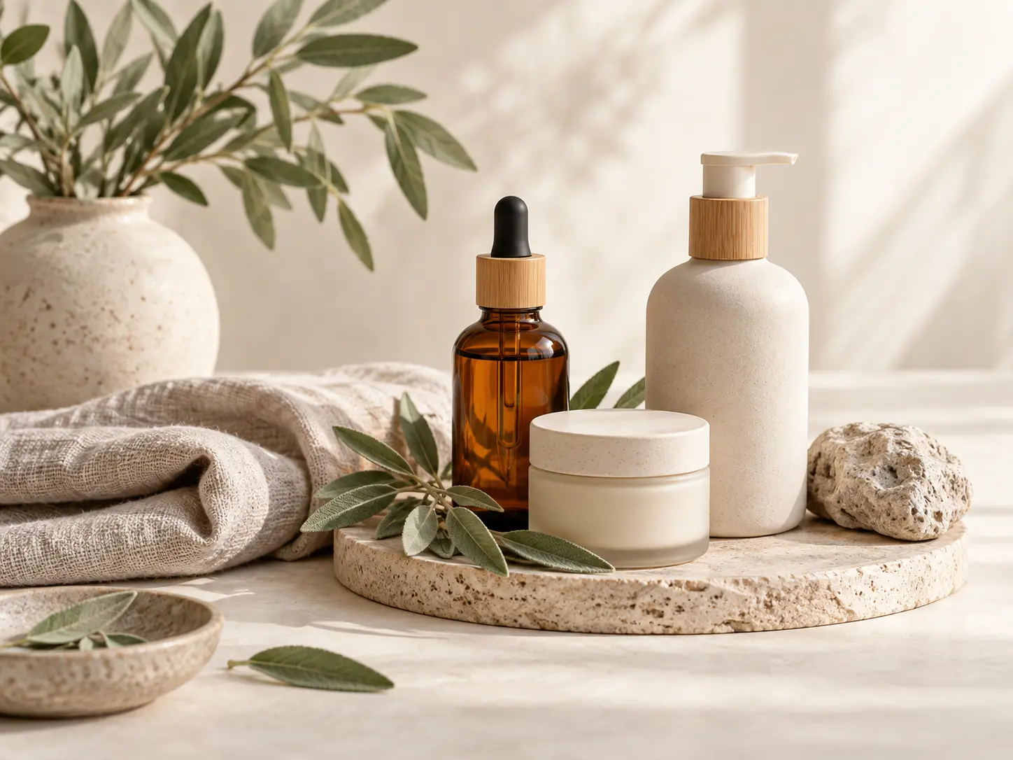
  • Natural skincare mood board with ceramic bottles, sage leaves, linen, and soft morning light
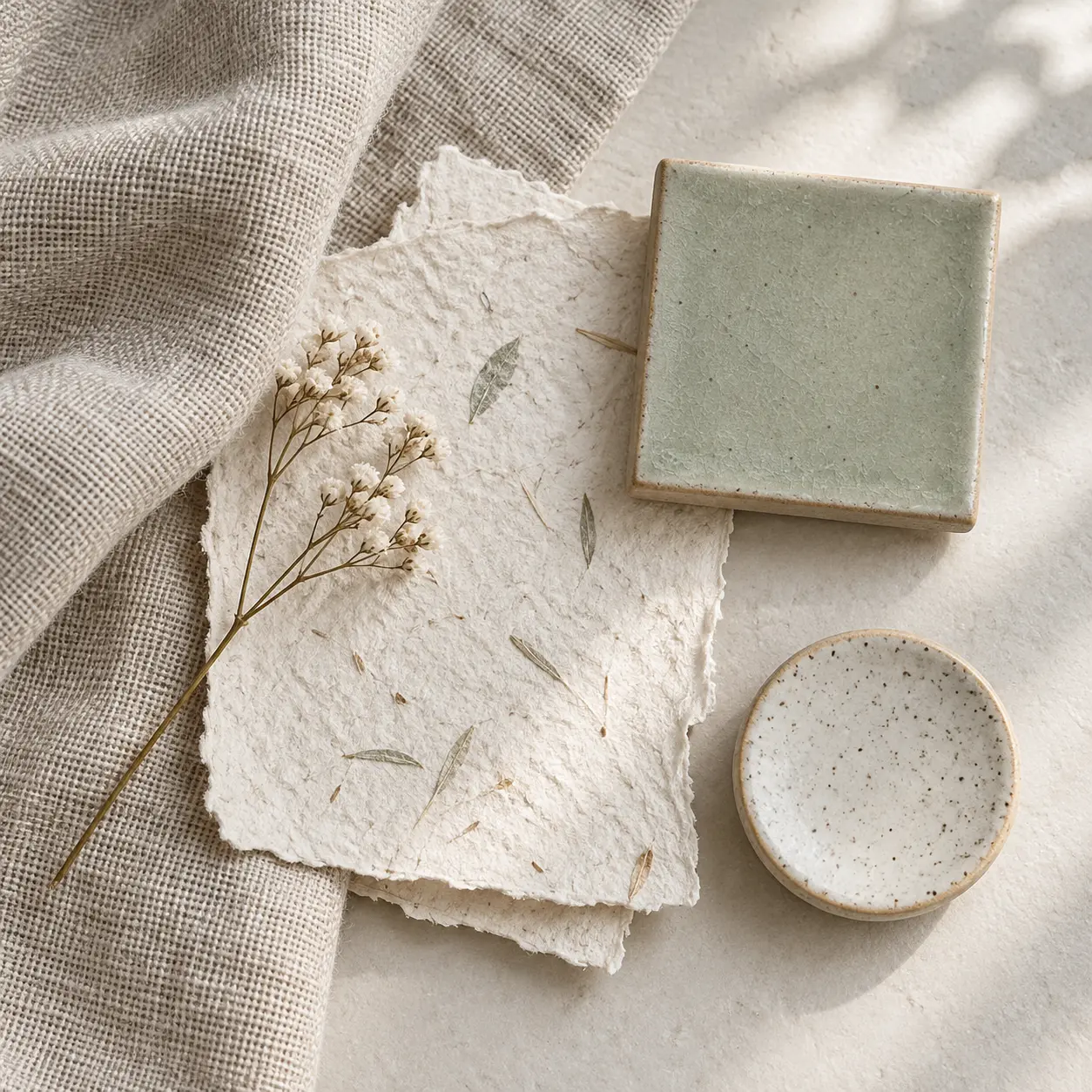
  • Close view of linen, botanical paper, and pale sage material samples for a mood board
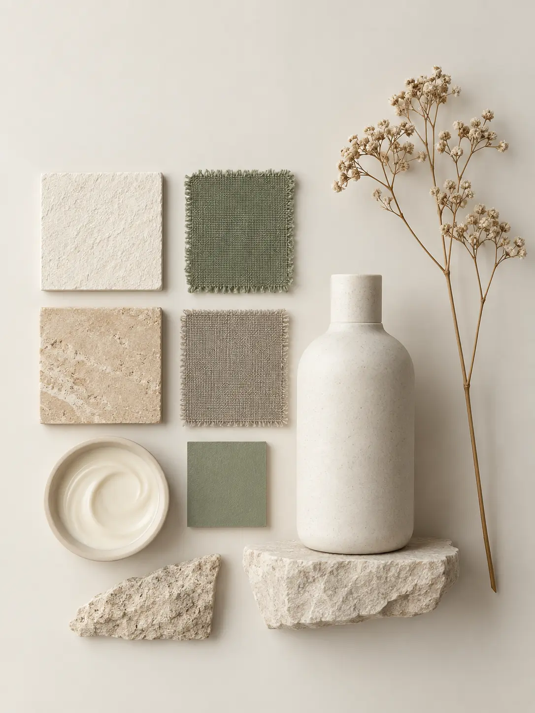
  • Minimal arrangement of cream, sage, and sand color references with a ceramic bottle
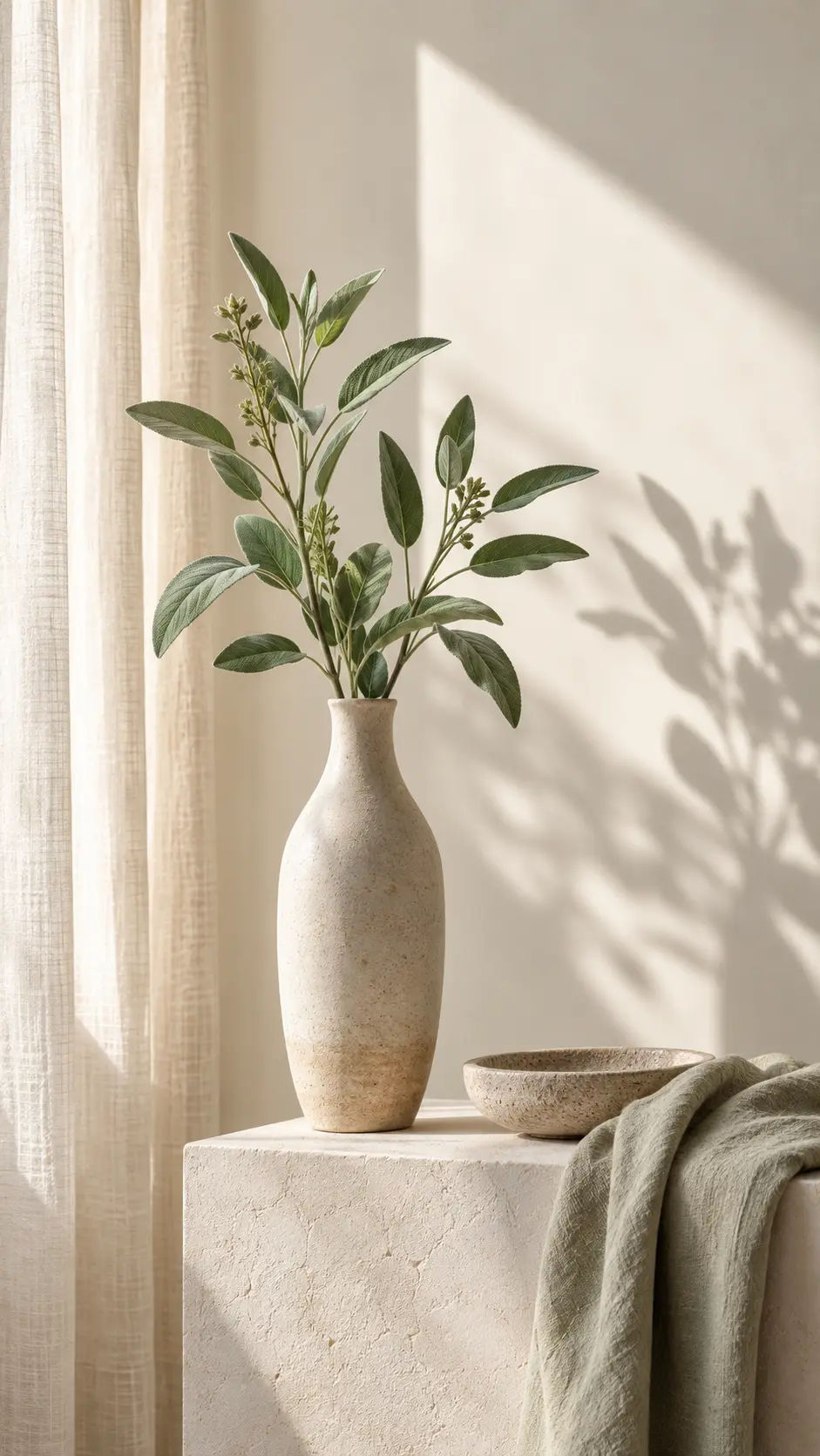
  • Tall botanical still life in a calm natural skincare palette for a mood board closing frame

How the Mood Board Maker Builds a Clear Direction

A useful mood board maker does more than collect attractive images. It sets a visual argument that a team can understand, discuss, and carry into production.

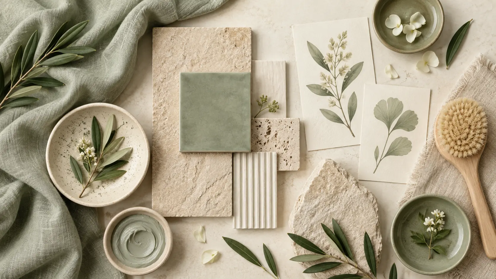
Natural skincare mood board samples arranged as a coherent atmosphere with ceramic and linen textures

Define the Atmosphere Before the Details

Start with the feeling the project should create, then add colors, materials, lighting, and composition. A clear mood board direction helps every image support the same visual story. A mood board maker also helps keep the set aligned to that direction. Keep in mind that the finished mood board is a directional reference, not a final production file or a finished design system. Before reusing the asset, check how it holds up in the portrait, square, and landscape formats used in the final presentation.

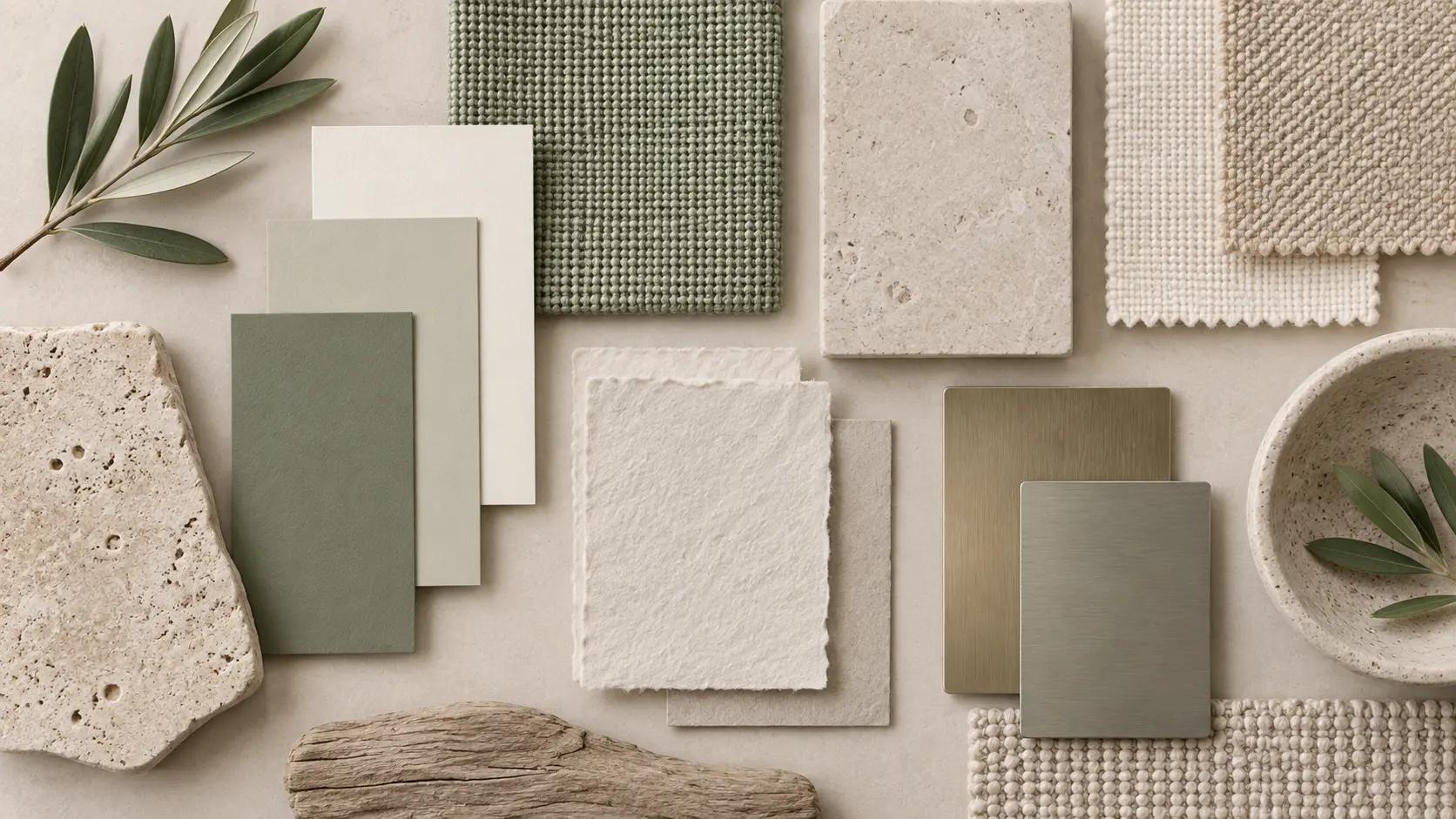
Color swatches, woven cloth, stone, paper, and paint samples organized for a material mood board

Organize Color, Material, and Texture

Use a restrained palette and repeat tactile references across several frames. Seeing paint chips, fabric, paper, and surface details together makes the direction easier to translate. With the mood board maker, set the overall feeling first, then arrange references so every image supports the same direction. Check whether the board communicates one idea instead of a random collection of attractive images before treating the result as finished.

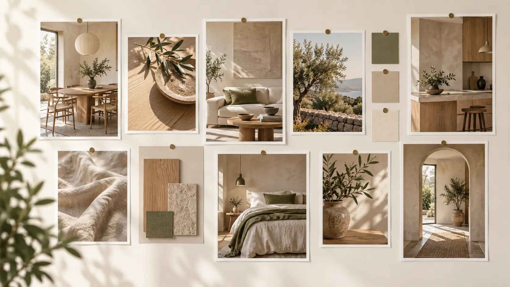
Edited group of related interior mood board references with a repeated restrained color palette

Keep Every Reference on the Same Brief

A strong mood board feels edited rather than crowded. A mood board maker makes it easier to give each image a role such as palette, texture, lighting, styling, or composition so the set communicates one clear point of view. Start with art-direction notes and approved reference images, then keep atmosphere, color, material, texture, and composition consistent while you compare directions. The final test is whether the board communicates one idea instead of a random collection of attractive images.

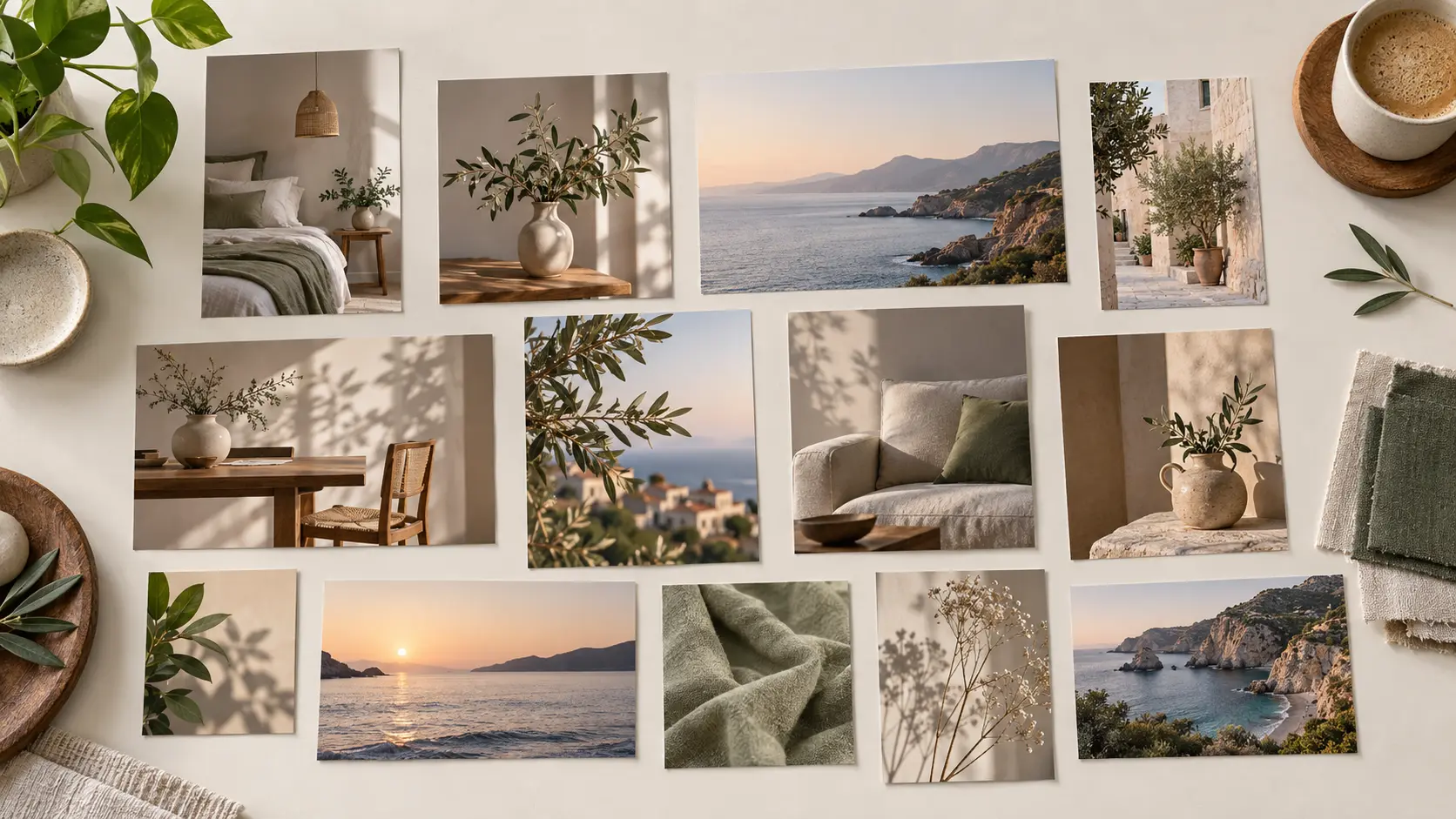
Mixed portrait, square, and landscape mood board prints arranged in a balanced reference wall

Shape the Composition for Different Ratios

Use square, portrait, landscape, or vertical frames intentionally so the mood board suits a presentation, printed sheet, or digital reference wall without losing the visual relationships. The mood board maker helps make a cohesive set work for campaign direction, interiors, photo planning, fashion, product, and editorial concepts, not merely to create an attractive preview. If the first attempt misses the mark, describe the exact part of atmosphere, color, material, texture, and composition to change and leave the rest of the direction fixed.

How the AI Mood Board Maker Turns a Brief Into a Direction

Three stages move from a written direction to a focused group of references you can review and share.

Step 01

Describe the Project and Feeling

Write the audience, setting, season, purpose, and emotional tone. Add colors, materials, lighting, and references to avoid so the mood board maker starts with useful constraints rather than generic style words.

Step 02

Generate a Cohesive Image Set

Create several frames that explore the same visual language from different angles. The mood board maker lets you compare palette, texture, subject, and composition, then regenerate the frames that drift away from the intended direction.

Step 03

Edit and Share the Direction

Select the strongest references, remove repeated ideas, and add concise labels for the team. Use the mood board maker to prepare the finished mood board so it can align styling, interiors, photography, campaigns, or the next stage of creative development.

Use Cases for the Mood Board Maker

Use a visual reference set when a project needs a shared direction before final design or production decisions are made.

01

Brand and Campaign Direction

Use the mood board maker to bring palette, photography, texture, and typography references into one visual world before a brand or campaign system is developed. Keep final logo artwork, messaging, and legal review in the appropriate professional workflow. Review the result in its intended crop and format, then adjust the wording if an important detail is unclear or the composition feels unbalanced. Start with art-direction notes and approved reference images, then keep atmosphere, color, material, texture, and composition consistent while you compare directions. The final test is whether the board communicates one idea instead of a random collection of attractive images.

02

Interior and Spatial Concepts

The mood board maker helps collect finishes, furniture forms, materials, lighting, and atmosphere for a room or renovation. Check real samples and site conditions before treating an image as a specification. Review the result in its intended crop and format, then adjust the wording if an important detail is unclear or the composition feels unbalanced. The strongest use of this feature is to make a cohesive mood board work for campaign direction, interiors, photo planning, fashion, product, and editorial concepts, not merely to create an attractive preview.

03

Photo and Video Planning

Use the mood board maker to set the lighting, wardrobe, props, locations, and color grade for a shoot. Share one reference board with the team so every frame follows a consistent visual intention. If the first attempt misses the mark, describe the exact part of atmosphere, color, material, texture, and composition to change and leave the rest of the direction fixed. Name the decision each image supports so the board remains a working reference rather than a loose gallery.

04

Fashion, Product, and Editorial Stories

The mood board maker helps explore silhouette, styling, material, and mood before a collection or product story is finalized. Use the board to discuss direction, then confirm sourcing, rights, and production feasibility separately. A focused brief is easier to judge than a crowded request, so decide which subject, message, or composition matters most before generating another version. When a direction changes, update the board and remove references that no longer support the final brief.

Who Uses this Mood Board Maker

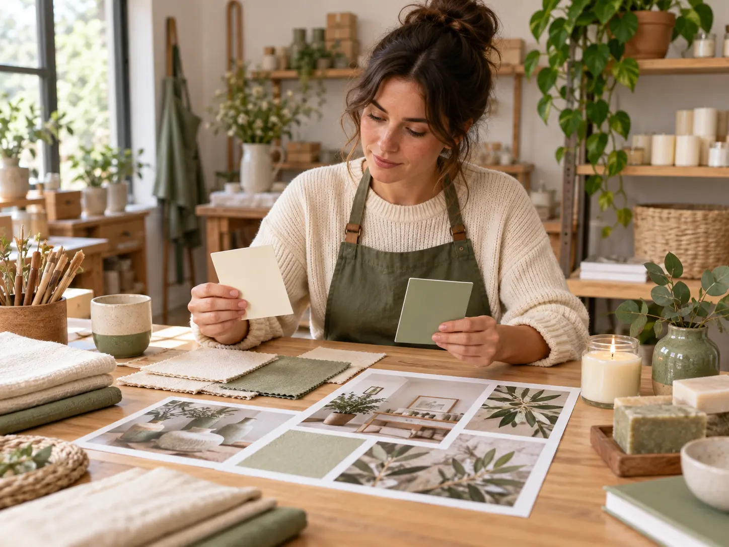
Creative team reviewing printed mood board references around a bright table without fake screens

Creative and Brand Teams

You need a clear visual direction before the design system, campaign assets, or production brief is complete. The mood board maker helps generate a focused set, which you can edit into a coherent board and use to align stakeholders around a shared visual language.

Mood Board Maker Questions

It turns a written art-direction brief into a collection of still images that explore a shared mood, palette, material language, or composition. Use the result as a visual reference, not as a fixed template or final production specification. Start with art-direction notes and approved reference images, then compare the output with that source. The mood board maker can prepare portrait, square, or landscape references depending on the presentation.

Describe the project, audience, atmosphere, colors, materials, lighting, subject matter, and references to avoid. Specific constraints help the set feel connected instead of like unrelated images. This matters for brand teams, interior planners, photographers, and creative directors, especially when the result will appear in campaign direction, interiors, photo planning, fashion, product, and editorial concepts. Keep the decision practical: choose the format that best fits where the finished board will appear.

A focused board often uses four to twelve strong references, but the right number depends on the project. Give each frame a role such as palette, texture, lighting, styling, or composition, and remove images that repeat the same idea. For a client presentation, group references by purpose and add short notes that explain why each example belongs. Keep the board editable as the project evolves.

A reference can guide the visual direction when you have the right to use it. It may not be reproduced exactly, so review the generated result for unintended logos, identifiable people, protected artwork, or brand elements. In practice, start with art-direction notes and approved reference images, then review whether the board communicates one idea instead of a random collection of attractive images before relying on the result.

Yes. A mood board communicates the visual direction for a project, such as a campaign, interior, photoshoot, or collection. A vision board usually organizes personal goals and affirmations. The purpose, references, and review criteria are different. The useful check is whether the board communicates one idea instead of a random collection of attractive images. Keep the format aligned with the presentation.

Review the current product terms and confirm that every uploaded reference, logo, product, or person is licensed for your intended use. The generator does not clear copyright, trademark, publicity, or client approval for you. For this workflow, confirm permission for every uploaded reference and avoid using third-party work as final artwork. The final choice should also fit the intended presentation, such as portrait, square, or landscape.

It is best for exploring and sharing a direction. Professional teams are still valuable for specifications, sourcing, typography, color management, accessibility, rights clearance, and final production. Start with art-direction notes and approved reference images, then compare the output with that source. Set the overall feeling first and arrange references so every image supports the same direction. This matters for brand teams, interior planners, photographers, and creative directors, especially when the result will appear in campaign direction, interiors, photo planning, fashion, product, and editorial concepts.
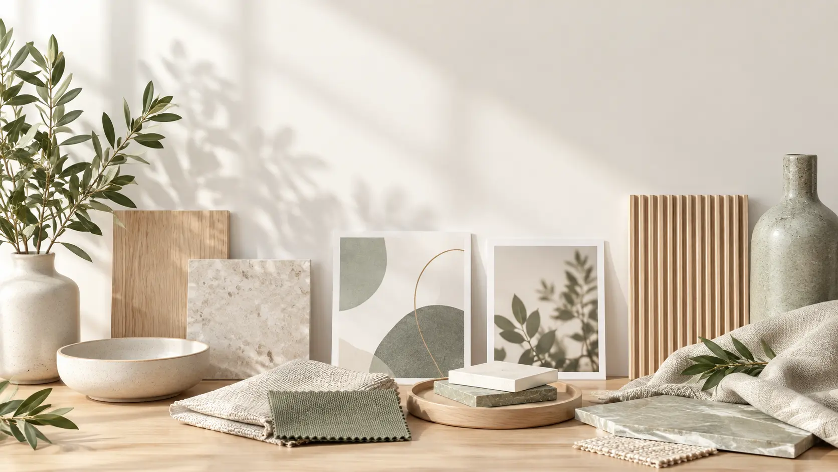
Wide table with natural material samples, printed mood references, and calm open space for call-to-action copy

Give Your Next Project a Clear Visual Direction

Describe the atmosphere and materials you have in mind, then use the mood board maker to create a mood board your team can discuss and carry forward.

Get Started
Mood Board Maker - Create a Visual Mood Board - VideoAI